Category Archives: website-offering

Fairness Rocks – Website

FR_Sq_logo (1)

“When CHC agreed to do the work on the FR site, I am not sure they realised how much content we would be sending them. They remained unphased throughout the development process and responded promptly to every tweak and addition. And when we told them that there were enquiries for French and Spanish language sub-versions down the line, they did not turn a hair. The team were helpful, patient and have, we believe, turned out a first rate website. Within only a week from launch, Fairness Rocks was showered in plaudits from members of the creative industries.”  – The Team at Fairness Rocks

BRIEF

Fairness Rocks is a website dedicated to inform the talent who seek to ensure they are receiving fair reward for their artistic endeavour.

A project we’re very proud to have been apart of, Fairness Rocks was started by the creators of the hit 1984 film, This is Spinal Tap, to help artists, musicians, actors, screen writers, composers, film directors and more receive their rightful share of the rewards for their work.

The website acts as a database for anyone who wants to be involved in the cause, and therefore, needed to be built to hold a large amount of information and to be updated regularly.

SOLUTION

It was important for Fairness Rocks to have a simple and easy-to-use CMS to allow them to post regular press and news updates. Since they are providing the public with an enormous amount of information and are frequently updating their website, we provide reliable on-going web support to their team.

The design was inspired by This is Spinal Tap to acknowledge the creators who have launched this important campaign.

Key website features include:

Full bespoke website design
Fully responsive
Custom wordpress CMS
Custom graphics & renderings
Custom animations
FairnessRocks_site

View this project

Bell Yard – Website

3GTH-ZGk_400x400

“CHC Digital quickly grasped what we needed, and how best to convey our messaging in a concise way with clarity and to visual effect. They were patient and constructive when engaging with us on this project and it was completed without fuss, on time and within budget. They are also very pleasant people to work with.” – Melanie Riley, Director Bell Yard Communications
BRIEF

Bell Yard is London’s leading litigation PR and legal sector reputation management consultancy. They came to us seeking a fresh and modern look for their website, with the ability to demonstrate and inform about their services.

SOLUTION

It was important for Bell Yard to have a simple and easy-to-use CMS to allow them to post regular press and news updates. Since they are frequently updating their website we provide reliable on-going web support to their team.

Key website features include:

Full bespoke website design
Fully responsive
Custom wordpress CMS
Google map integration

BellYard_site

View this project

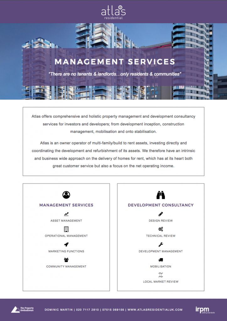
Atlas Residential – Website & Flyer

AtlasLogo

“It has been a pleasure to work with CHC Digital – they have been patient and proactive through the website build process, offering recommendations and turning around changes extremely promptly.” – Dominic Martin, UK Business Development Director
BRIEF

Atlas Residential is a vertically integrated global owner operator of income-producing residential apartments in North America and the United Kingdom. They were looking for a website that would allow them to quickly and concisely convey their services and development opportunities. In addition, they wanted to show off their impressive track record of success, and to keep their investors up to date with the developments.

SOLUTION

We created a WordPress site, allowing Atlas Residential to update the outward facing portfolio and news. Alongside this, there is an investor login portal, which allows visitors to access the latest reports and view the progress of the developments and their expected returns.

RESULTS

A fully responsive website which is easy to manage and allows for a visitor to get a clear view of what Atlas Residential has to offer and how they approach their investments and developments.

AtlasResidential_site

View this project

Screen Shot 2017-09-28 at 14.12.15

View this project

CLCA – Website

CLCA_Logo_225

“CHC have a can-do attitude and combine technological know-how with a keen desire to make websites user friendly and the right fit for their clients. They helped us to achieve something much more modern without breaking the bank. It was a pleasure to work with the CHC team.” – Louise Beeson, Chairwoman of the CLCA

BRIEF

The Crisis & Litigation Communicators Alliance (CLCA) is a growing international association of specialist PR firms who are experts in their respective fields. The CLCA wanted a new website to refresh and update their look. The website needed to act both as an information tool for clients and prospective new members.

SOLUTION

We worked closely with the CLCA team to provide them with an on-brand and easy-to-use website. Designed and developed by our team, we created a custom content management system to allow the CLCA to upload and curate content on their website easily and quickly.

Key website features include:

Full bespoke website design
Fully responsive
Custom wordpress CMS
Google map integration
Embedded video


CLCA_site
View this project

Twenty20 Capital – The Basic Website

2020_400

BRIEF

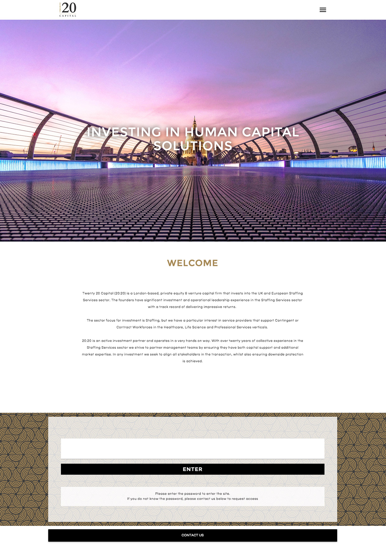
Twenty20 Capital are a private equity company that specialise in investing in human capital businesses. They required a brand identity and website that would represent them as a credible investor, all within a three week timeframe.

SOLUTION

We developed the brand and site layout simultaneously to cut down on the development timeframe. The Twenty20 Capital group wished to keep a large amount of the information protected and only visible to those who they gave access. We developed the site to include password protection to give them the security they desired.

RESULTS

The site launched on deadline, with all features and content completed. The site is fully responsive and search engine optimised. They have enjoyed a successful round of investment.


2020_site
View this project

Milton House – Website & Brochure

Miltonhouselogo3

BRIEF

Milton House is a luxury property development based in Haywards Heath. Their goal was to appeal to couples in their mid 20s to late 30s who were looking to make their first home purchase. They wanted to create a community of like-minded homeowners to ensure that the building developed it’s own ‘neighbourhood’ feel. The Milton House project required branding and a website which they would be able to easily control.

SOLUTION

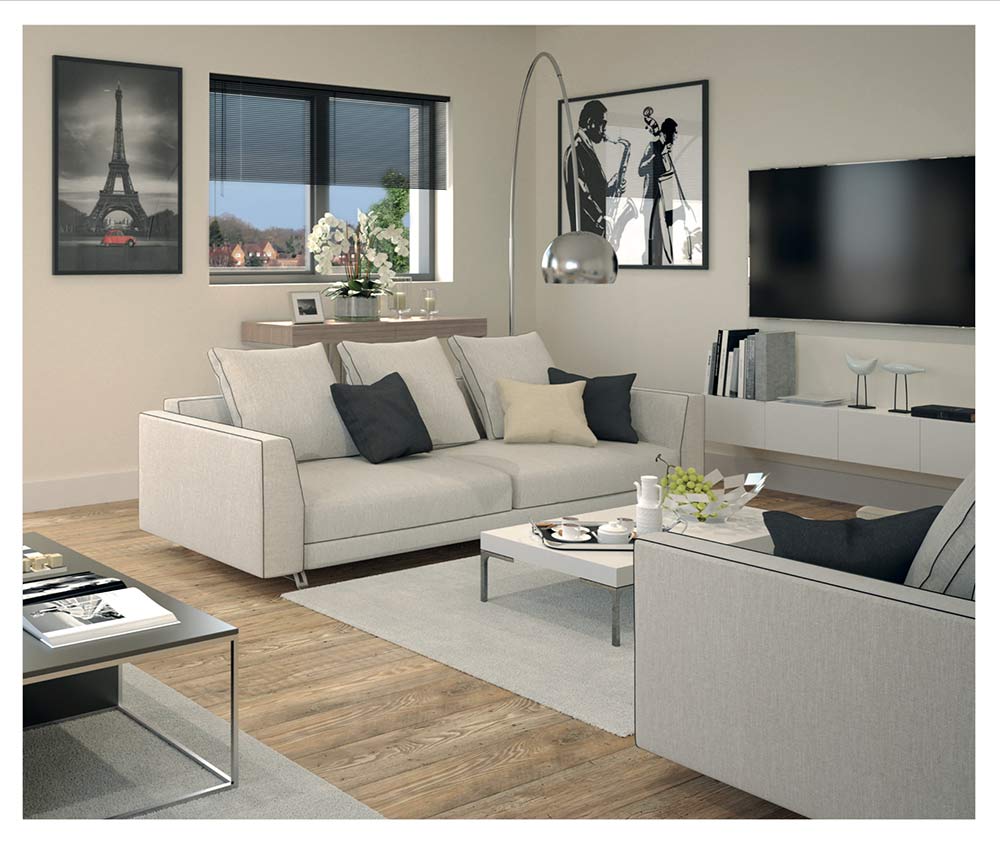
We created a brand that targeted Milton House’s key demographic, appealing to those who enjoy a ‘Soho House’ lifestyle. We developed a bold brand, continuing the theme throughout the site. Using striking colours and a simple layout, we created a contemporary feel that matched the aesthetic of the development itself.

Alongside this, we developed a print brochure to be presented to potential home buyers.

RESULTS

Milton House was awarded a Horizon Interactive Media Award for design and development. The site is fully responsive, search engine optimised and was well received. The print brochure was beautifully finished with perfect binding and spot UV throughout.

Milton House was 100% sold out within 4 months.

miltonHouse_site
View this project


1


2


3


4

View this project

Torture Garden – Website

TG-logo-1

BRIEF

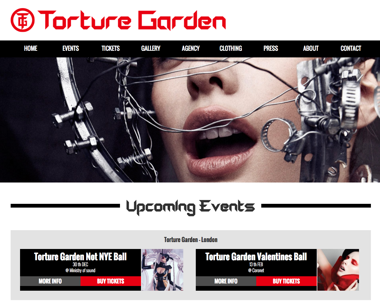
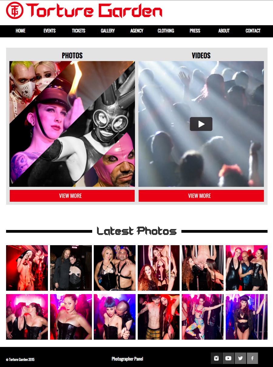
Torture Garden is the world’s leading creators of fetish events and BDSM. When they approached us, they had an outdated and ineffective website. They enlisted us to build them a site that would match the sophistication of their events and which would be mobile-friendly. The site also required a ticket booking engine.

To ensure they weren’t missing out on promotional opportunities and to keep an archive of press-quality images, Torture Garden also requested a means for photographers to upload photos which could then be curated by management before the site went live.

SOLUTION

We created a comprehensive back-end system that made event booking very simple.

We developed a system where the TG team could create photographer profiles, allowing photographers to upload images from events. This gave TG a centralised online system that simplified the process of retaining press-quality images.

The simple, on-brand design allows the character of the events hold visitors’ focus.

Screen Shot 2015-12-09 at 13.56.10

RESULTS

Torture Garden sold out of their first event within 24 hours after the site had been launched. The site received a good response from the community and the photographers in particular, were very happy about the improved uploading channel.

tg_sellout

Screen Shot 2015-12-09 at 13.57.21

Screen Shot 2015-12-09 at 14.01.47

View this project

Finch & Partners – Website

Finch_and_partners_logo

BRIEF

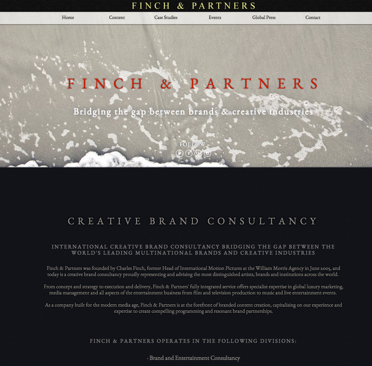
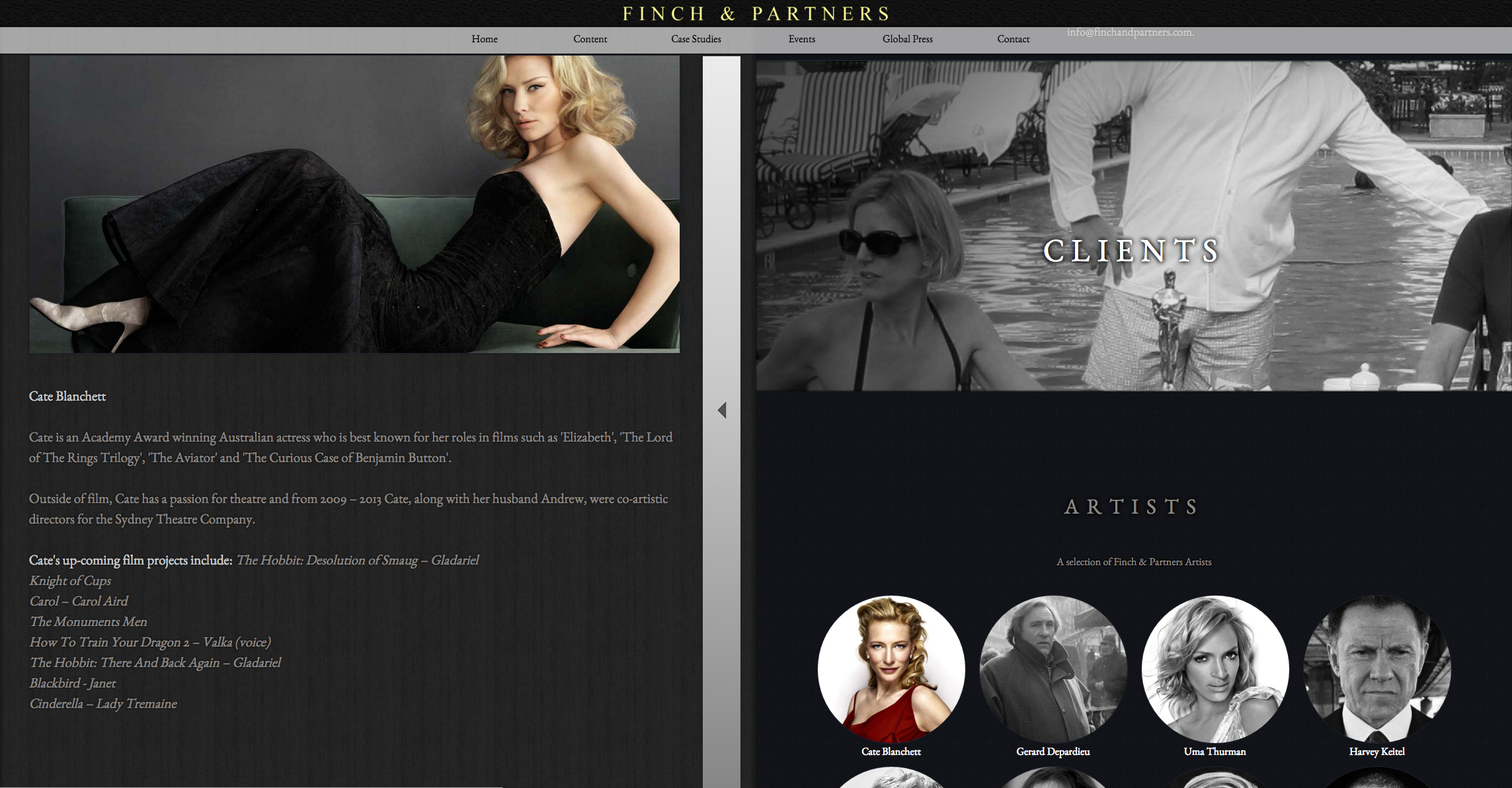
Finch & Partners is a creative brand consultancy that bridges the gap between leading multinational brands and creative brands.

They had a very outdated website that did not represent their services and which had poor SEO. Finch & Partners wanted an easy-to-use, design-led, state-of-the-art website to quickly convey their multi-channel global service offerings.

SOLUTION

We created a website that pushed the capabilities of online development to simply convey a complex service.

The website was responsive and optimised for SEO, but more importantly, it was a one-of-a-kind with innovative design that was tailored perfectly to the needs of the client.

Screen Shot 2015-12-09 at 13.01.29

RESULTS

The company saw increased lead generation through the website and online applications.

The site won 8 awards, including the prestigious Awwwards which recognise the talent and effort of the best web designers, developers and agencies in the world. As a result, our in-house creative was ranked 480th best cross-specialty designer in the world (A-Design Award).

awards

Screen Shot 2015-12-09 at 13.02.03

Timothy James Consulting – The Bespoke Website

TJC_LOGO_CMYK-72-dpi

BRIEF

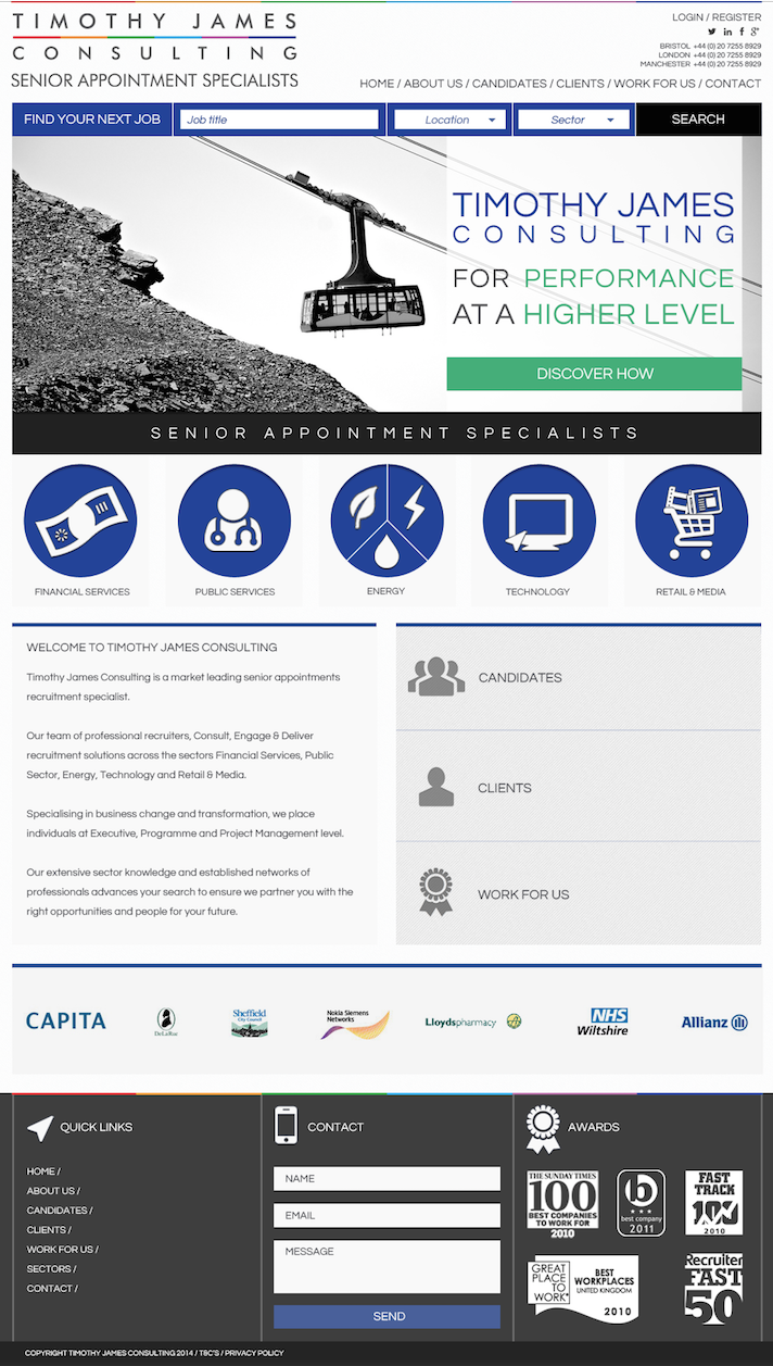
Timothy James Consulting is a recruitment company specialising in energy, media, healthcare and finance.

They were struggling to post jobs online in a timely and efficient manner, as they were utilising multiple advertising platforms and, at the time they approached us, had to post jobs individually on each platform.

Our brief was to make a website that allowed applicants to search for jobs, create a candidate profile and upload a CV whilst improving the aesthetic, optimising SEO and ensuring responsiveness.

SOLUTION

Working very closely with the Timothy James operations team, we devised a strategy in which the website could be a central hub, allowing the team to upload each advert to one place, subsequently utilising technology to distribute across the web.

We developed a content management solution (CMS) that allowed them to edit content very easily and included custom-made applications for CV catching and distributing.

RESULTS

The streamlined functionality of the design increased efficiency throughout the company which in turn increased applications through the website.

Additionally, our integrated customer-relationship management (CRM) solution allowed Timothy James to keep track of candidates in a centralised system.

Screen Shot 2015-12-09 at 12.44.08

CHUCS – The Bespoke Website + Campaign Management

CHUCS_LOGO

BRIEF

CHUCS is a luxury swimwear brand based in the heart of Mayfair.

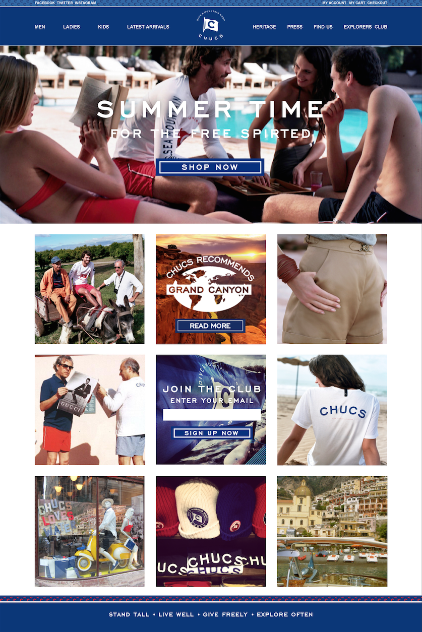
Although in-store sales were strong, the company’s online presence struggled to perform in the same manner. At the time they approached us, their site had sold around £10k total in its two-year lifetime .

The site was extremely slow, non-responsive and was struggling with search engine results. Additionally, the user interface caused unnecessary hurdles that hindered sales. On a limited budget, they briefed us to take whatever action was necessary to boost online sales and enhance community growth and engagement within their 800 followers.

SOLUTION

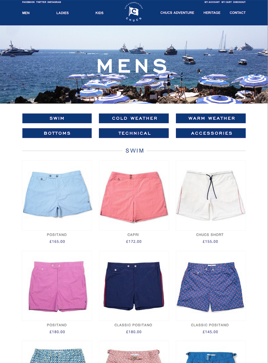
The redevelopment of the CHUCS website on a comprehensive and scalable platform (called Magento) and high standards of SEO were implemented.

Alongside this, the development was optimised for rapid page loading, reducing the average loading time from 10 seconds to just under one second per page. Analysis of the old site had demonstrated key hurdles for purchase; the redesign seamlessly removed any blocks to purchase while maintaining a high-end design aesthetic that suited the brand ethos.

Screen Shot 2015-12-09 at 12.30.27

RESULTS

Throughout the rapid redevelopment, we launched a social media campaign to increase the reach to potential customers.

The drop off of user flow throughout the site was greatly improved by the refreshed design. The CHUCS community on twitter grew from 500 followers to 27,000 followers. As a result, the site had  transactions worth over £200K in 8 months.

Due to the success in this period, the brand was bought out by a venture capital group in a multi-pound deal and is currently undergoing a redesign of all clothing lines.

Screen Shot 2015-12-09 at 12.33.40

Screen Shot 2015-12-09 at 12.35.04

The Lucky Onion – Website

LO_logo

BRIEF

The Lucky Onion is an award-winning group of restaurants and hotels located in the Cotswolds. When they approached us, they were looking to increase staff numbers between 20% and 30%; the estimated budget to do this through traditional recruitment would have been about £60k. To cut costs and capitalise on the opportunity to recruit more dynamically, The Lucky Onion decided they wanted to implement their own recruitment strategy.

Due to the increased levels of staffing, maintaining a key understanding of employees’ well-being and progress has become an increasingly complex challenge. As such we were requested to develop an online appraisal system that would allow the employees to report their progress and accomplishments in an eco-friendly and time efficient manner while providing management with a digital platform to set goals and nurture employees’ talent.

SOLUTION

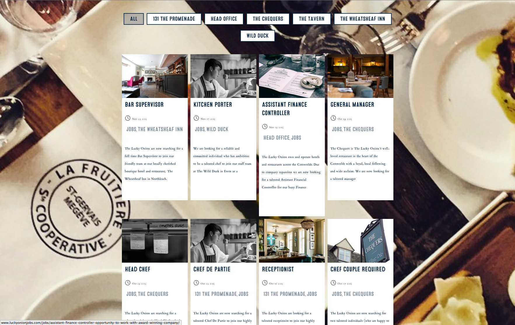
We produced an easy-to-use platform that visually represents The Lucky Onion brand and communicates their ethics.

The site is up to modern day standards, completely responsive and SEO friendly. It includes the functionality for job applicants to upload CVs and candidate data, which is stored in a database.  This gives The Lucky Onion HR team a pool of talent to choose from when a new position becomes available.

To bolster this solution and ensure a targeted reach for specific roles and locations, we simultaneously implemented a social media strategy. The main challenge was finding skilled candidates in a remote area of the UK. This was done by building a community of strategically defined followers that have been actively engaged in the recruitment process.

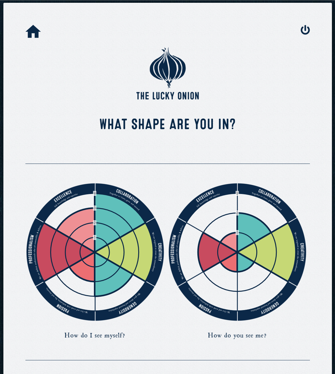
Finally, the appraisal system was built on a custom content management system (CMS) which allows management to create unique profiles for each employee. Employees can confidentially update their profile and management can also comment on employee development. The system also produces a PDF to give employees a visual representation of their development.

Screen Shot 2015-12-09 at 11.23.04

RESULTS

To ensure ease of use, we built an outward-facing recruitment website using WordPress. The detailed design was influenced by consistent input from The Lucky Onion’s in-house design team. The data capture of applicant CVs has been so successful that in 87 days they gained over 100 candidates. This success was largely the result of the ongoing digital marketing campaign that to date has reached 1,800,000 people.

The digital appraisal system has made it easy to track employee development and monitor status of complete/incomplete appraisals. It has also reduced overall administration of the process, is quick and easy to use and eco friendly, as well as being cost saving.

Screen Shot 2015-12-09 at 11.30.01