Category Archives: websites

Advice from a Web Developer: can you build your own website?

Very simply, the answer is of course you can build a website yourself. I am a firm believer that anyone can do pretty much anything if they set their mind to it, so real question is: is it worth your time, what will be your challenges and will you see positive results?

TIME

One very important reason that our clients come to us to build their website is the amount of time it will take to build a website. If you plan to build it yourself, be prepared to spend a large amount of time on it! There is a reason it is expensive to hire a web designer/developer and that’s because you are paying for their time (as well as their skill and expertise). And if it is time consuming for a professional to build a website, then it is safe to say it will take a novice more time.

EXPERTISE

The next thing to consider is whether or not you have the expertise that is required for the site you’re building. Is it important, for example, that your visitors have a good user experience? Can you optimise your website for search engine results to the extent needed? Does your website need to be design-focused? Do you need help with branding your company? If your website is going to act as merely a shop window or be purely informational, you might decide that hiring a web designer is just not worth it. On the other hand, if providing your visitors with a good user experience is going to increase your sales it might be worth investing in someone else’s expertise.   

FLEXIBILITY

There are great templates by providers such as WordPress, Wix and Squarespace out there, but sometimes your desired website doesn’t fit in to a template. If your website needs to perform tasks specific to your company or if you would like to utilise your website to minimise and automate administrative tasks, templates can become problematic. For a small start up, it is a great way to get up and running quickly but we would always recommend budgeting for an upgrade as your business grows.

SITE INTELLIGENCE

Do you need your website to do something? Recent studies show that companies that automate lead management see a 10% or more bump in revenue in 6-9 months time (source: https://www.hubspot.com/marketing-statistics). If you’re looking to use your website as more than a shop window, to assist you with sales or administrative tasks for example, then it can be worth investing in your site’s intelligence. Time is money, after all, and the more you can utilise your website to cut down time spent on daily tasks, the better.

The fact is that websites have become an integral part our lives and are increasingly well built. Users are becoming less tolerant of functionally poor and outdated sites. It can feel almost impossible to spend the money on a site that will become outdated within a few years, which is why we always suggest investing in a scalable website. This means your website can be an evolutionary process, where it grows, expands and adapts. Start small, if your budget requires it, and continue to invest in it over time.

Fairness Rocks – Website

FR_Sq_logo (1)

“When CHC agreed to do the work on the FR site, I am not sure they realised how much content we would be sending them. They remained unphased throughout the development process and responded promptly to every tweak and addition. And when we told them that there were enquiries for French and Spanish language sub-versions down the line, they did not turn a hair. The team were helpful, patient and have, we believe, turned out a first rate website. Within only a week from launch, Fairness Rocks was showered in plaudits from members of the creative industries.”  – The Team at Fairness Rocks

BRIEF

Fairness Rocks is a website dedicated to inform the talent who seek to ensure they are receiving fair reward for their artistic endeavour.

A project we’re very proud to have been apart of, Fairness Rocks was started by the creators of the hit 1984 film, This is Spinal Tap, to help artists, musicians, actors, screen writers, composers, film directors and more receive their rightful share of the rewards for their work.

The website acts as a database for anyone who wants to be involved in the cause, and therefore, needed to be built to hold a large amount of information and to be updated regularly.

SOLUTION

It was important for Fairness Rocks to have a simple and easy-to-use CMS to allow them to post regular press and news updates. Since they are providing the public with an enormous amount of information and are frequently updating their website, we provide reliable on-going web support to their team.

The design was inspired by This is Spinal Tap to acknowledge the creators who have launched this important campaign.

Key website features include:

Full bespoke website design
Fully responsive
Custom wordpress CMS
Custom graphics & renderings
Custom animations

FairnessRocks_site

View this project

Why we chose to partner with Kentico

We are so pleased to announce our new partnership with Kentico enterprise solutions. With GDPR fast-approaching and data-driven marketing becoming increasingly important, we wanted to find a reliable content management system that could support our clients needs in the long term. When we found Kentico, we knew we didn’t have to look any further!

Kentico

STABLE AND SCALABLE

We hear over and over again from clients that their website has become “outdated,” both in aesthetics and functionality – and they’re not wrong to worry. Online browsers have less tolerance for outdated websites than ever before. The problem is that the online world changes so quickly which means your website will age at a rapid rate unless you keep on top of it. But of course, this can be extremely expensive.

We chose Kentico because it is a stable scalable solution. It provides our clients with the benefits of out-of-the-box functionality – including an easy to use backend – with the ability to customise and grow their websites. In other words, this solution means that your company won’t outgrow the capabilities of your platform.


INTUITIVE MARKETING

When it comes to digital marketing, there is so much that you can do using your website alone, so we sought to find a partner who could provide our clients with an easy-to-use platform which would incorporate smart and intuitive marketing, resulting in an increased number of leads and conversions coming through your website.

The best way to do this is through personalised content curation. This means that you can present each visitor with content that best matches their interests and automate the marketing collateral they receive based on where they are in the customer life cycle.

With Kentico’s lead scoring system, you can easily target and curate content based on the customer’s engagement with your brand. For example, if a customer on a news site only browses the technology section, you can curate the homepage they view to only show them technology articles. And further than that, you can send them automated e-mails with content they are interested in. Each customer who visits your site will see the information most relevant to them making them more likely to engage with your company.


GDPR COMPLIANT

The GDPR frenzy has been on everyone’s mind in 2018, and as a website agency, we needed to ensure that we had a reliable solution. Our partnership with Kentico means that we can build an easy-to-use 100% GDPR compliant CMS. This means that all of your customer/client data lives in one place making it a simple click of a button to download or delete a single user’s data.

Websites and marketing programmes capture a huge amount of data, some of which you may not even be aware of, and this is where a Kentico CMS can bring a big advantage. When you’re juggling between your CMS, mailchimp and/or any other marketing platforms you’re using, it can be difficult to consolidate all your data in one place. But with Kentico, it all lives under one roof (in a manner of speaking) which means it is easier to access and amend. Further to that, it means that you can safely and securely market to your audience without worrying you are breaking any GDPR regulations.


FIND OUT MORE ABOUT KENTICO WEBSITES

What your website needs in 2018

It is estimated that Google now processes over 40,000 searches per second. That’s about 3.5 billion searches per day and 1.2 trillion per year. In 2016 it accounted for around 34% of website traffic, and in the same period in 2017, it increased to over 50%.

With traffic and searches being used more and more each year, 2018 is set to be a very competitive year online. If you have been putting off investing in your website, now is the time to move forward. The online world is getting faster and faster, and unless you keep up, you’re in danger of being left behind.

Not only is being found through search engines increasingly important, it is now imperative that your site is working hard to keep visitors on your site and to encourage them to take action.

If you’re not sure where to start (or where to invest), we have taken the time to highlight our top 4 elements that your website should have in 2018.


THE IMPORTANCE OF A/B TESTING IN IMPROVING CONVERSIONS

First, lets explore what A/B testing is. This is a method for testing the performance of different website elements to improve its functionality. For example, if you have a button on your site that leads to a sale, it is vital that this button is designed to convert at the highest rate.

You can of course take an educated guess – bold colours, for instance, draw the eye and are more likely to be clicked. However, there is no way to make an informed decision on shape, size or specific colour.

A/B testing allows you to test two options at once. By testing in this manner you can track the performance of both options and choose the one that is performing best. This eliminates any personal preferences and focuses on what will increase your conversions.

The best approach is to test one element at a time – size, shape, placement, and colour should all be tested individually. A/B testing lets you to work to continually improve your website based on data collected from the people who actually use it, allowing your site to grow and evolve to suit your demographics. You will avoid the need to make assumptions and costly amendments without clearly understanding what will work.


ENGAGE YOUR AUDIENCE WITH PERSONALISED CONTENT

Content is king. Current trends show that this catch phrase is becoming more and more relevant each year.

You may have good intentions while filling your site with content, but does it reach its intended audience? Do the people who love tech stories see your latest tech articles, or are they buried under the international politics stories?

Websites collect a great deal of data about your visitors, and if you use this data in the right way, you can deliver personalised content to any returning visitor. If a visitor has spent hours reading tech related content, why not show them more tech stories?

By creating personas in the brains of your website, you can tell your website to show a visitor content based on what type of persona they match. In order to do this, you must lay out different personas based the types of content you have. For example, if you publish tech and sports news then you could have a “sporty” persona and a “techy” persona – and an additional “sporty tech” persona, covering both. If you have a visitor that spends the majority of their time on the tech pages, you can reduce the priority of the sports content on the site (effectively dropping it to lower down on the page). This will encourage the visitor to stay on your website, since they are consistently being presented with more content that they are interested in.

Personalised content will work for any industry, as different elements of the site can be adapted based on the actions that their visitors take. After a visitor has signed up to your mailing list, you can remove the ‘sign up to our mailing list’ section so that they no longer see it. Furthermore, you can replace that section of the site with something that adds more value. This will give the visitor the feeling that the site is adapting to them and offering a tailored experience.

Your website is your most important sales tool. Users will judge your business on how it looks, how it works and the content it provides. Personalised content allows your site to continue to impress and interest them.


LEAD SCORING & MARKETING AUTOMATION

Lead scoring is nothing new. Anyone with sales experience will have a system of judging how close someone may be to making a purchase. They’ll also know that it is extremely time consuming. Tracking potential customers, leading them down the pipeline and choosing the right time to close a deal are all delicate tasks that require constant attention.

What if your website could do it for you? Setting up lead capturing functions including contact forms, enquiries, quotation tools and white papers (to name just a few) is paramount. In the background, your website can record and score visitors based on their interactions with the site. If they spend 10 minutes on a page about your services, that’s 10 points! When your site records that a user has acquired 65 points, you can even get your website to reach out to them for you. By scoring visitors you can create point scores that act as a trigger for marketing automation to commence. So when our visitor hit 65 points, the website would send them an email to encourage them to take more action; book a meeting time, arrange a demonstration or whatever brings you closer to closing a deal. If they take this action, that can be tracked and scored as well. If they don’t respond, the site can be set to follow up with another email – all tailored to the customer. This process can continue in a predetermined flow to ensure that you are following every lead, night and day, 24/7.

Having this system in place allows your sales team to avoid these time consuming tasks and concentrate on the skilled profit-making part of their job.

GDPR

GDPR

In May of this year a new piece of legislation called GDPR will come into effect. Among other things, it will enable visitors to your website to request a full report on how their data has been used and to delete it, if they wish. If you can’t or don’t comply with GDPR, you are liable for a fine of up to 4% of your company’s global turnover or €20 million (whichever is more).

Almost all sites do actually capture a vast amount of user data. For the majority of existing sites, however, accessing and deleting this data is no easy process. It would involve consolidating all of your data, potentially running across millions of rows, and searching through it for information relating to the user who requested it – and then, manually creating a report for them.

Fortunately, we have been working on finding an easy solution to the problem and have a platform that will allow you to capture huge amounts of user data, all 100% GDPR compliant. If a visitor requests their data (Right to Access) you can provide them with a custom URL within a matter of minutes. If they request for this data to be deleted (Right to be Forgotten), the system simply has a delete button to remove the data without damaging the rest of your user data. Having a GDPR compliant site is simply going to be a must have for 2018.

Read more about GDPR


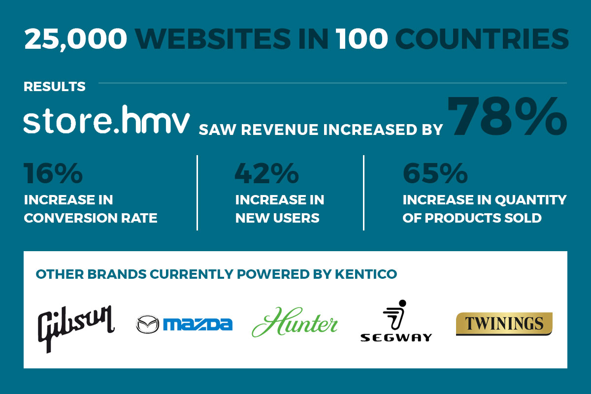
2018 marks the start of a new partnership for CHC Digital. We have partnered with Kentico, a great bunch of smart chaps who have created the most sophisticated CMS we have ever seen. The Kentico CMS is easy-to-use, easy-to-customise, fast, stable and good to design and develop with. It provides a centralised location for your all of your marketing and sales requirements, and allows you to collect and use data all on one platform. Most importantly, it efficiently tackles the hard work that many websites struggle with, such as the ones listed in the topics above. To find out more, visit our Kentico page here.

Bell Yard – Website

3GTH-ZGk_400x400

“CHC Digital quickly grasped what we needed, and how best to convey our messaging in a concise way with clarity and to visual effect. They were patient and constructive when engaging with us on this project and it was completed without fuss, on time and within budget. They are also very pleasant people to work with.” – Melanie Riley, Director Bell Yard Communications

BRIEF

Bell Yard is London’s leading litigation PR and legal sector reputation management consultancy. They came to us seeking a fresh and modern look for their website, with the ability to demonstrate and inform about their services.

SOLUTION

It was important for Bell Yard to have a simple and easy-to-use CMS to allow them to post regular press and news updates. Since they are frequently updating their website we provide reliable on-going web support to their team.

Key website features include:

Full bespoke website design
Fully responsive
Custom wordpress CMS
Google map integration

BellYard_site

View this project

Atlas Residential – Website & Flyer

AtlasLogo

“It has been a pleasure to work with CHC Digital – they have been patient and proactive through the website build process, offering recommendations and turning around changes extremely promptly.” – Dominic Martin, UK Business Development Director

BRIEF

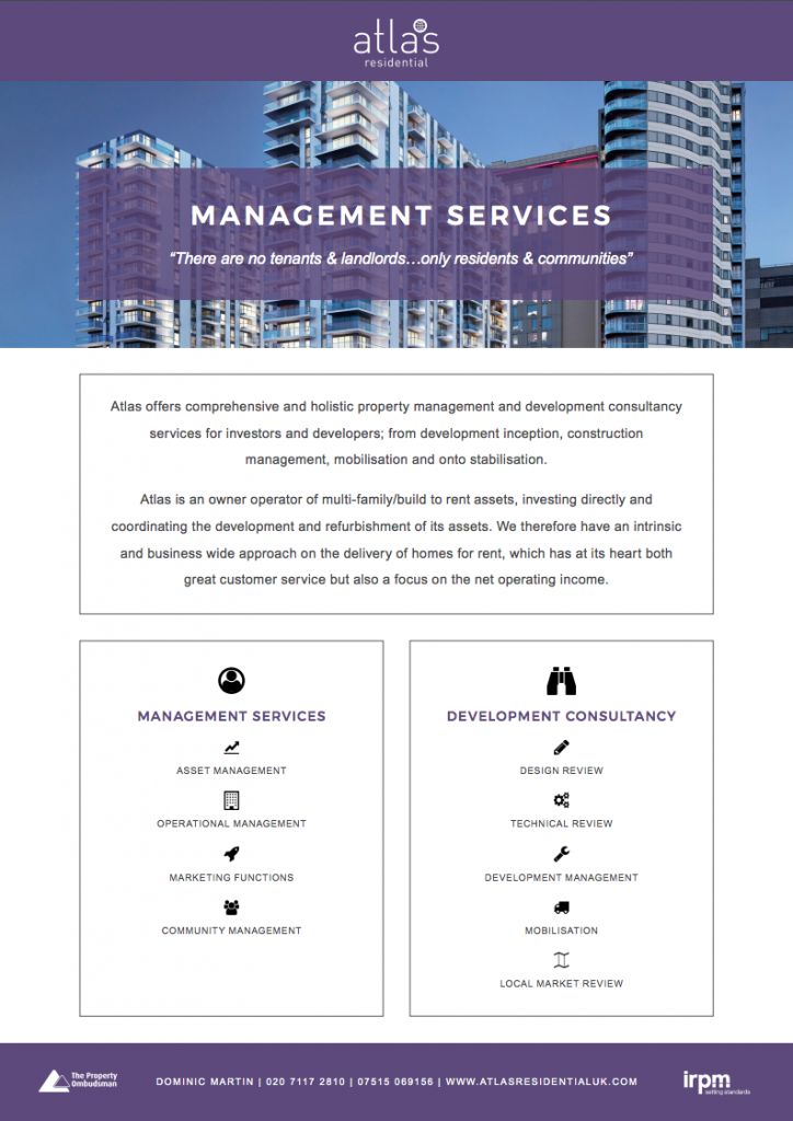
Atlas Residential is a vertically integrated global owner operator of income-producing residential apartments in North America and the United Kingdom. They were looking for a website that would allow them to quickly and concisely convey their services and development opportunities. In addition, they wanted to show off their impressive track record of success, and to keep their investors up to date with the developments.

SOLUTION

We created a WordPress site, allowing Atlas Residential to update the outward facing portfolio and news. Alongside this, there is an investor login portal, which allows visitors to access the latest reports and view the progress of the developments and their expected returns.

RESULTS

A fully responsive website which is easy to manage and allows for a visitor to get a clear view of what Atlas Residential has to offer and how they approach their investments and developments.

AtlasResidential_site

View this project

Screen Shot 2017-09-28 at 14.12.15

View this project

CLCA – Website

CLCA_Logo_225

“CHC have a can-do attitude and combine technological know-how with a keen desire to make websites user friendly and the right fit for their clients. They helped us to achieve something much more modern without breaking the bank. It was a pleasure to work with the CHC team.” – Louise Beeson, Chairwoman of the CLCA

BRIEF

The Crisis & Litigation Communicators Alliance (CLCA) is a growing international association of specialist PR firms who are experts in their respective fields. The CLCA wanted a new website to refresh and update their look. The website needed to act both as an information tool for clients and prospective new members.

SOLUTION

We worked closely with the CLCA team to provide them with an on-brand and easy-to-use website. Designed and developed by our team, we created a custom content management system to allow the CLCA to upload and curate content on their website easily and quickly.

Key website features include:

Full bespoke website design
Fully responsive
Custom wordpress CMS
Google map integration
Embedded video


CLCA_site
View this project

3D Websites: To 3D or Not to 3D

A few years ago, we toyed with the idea of building a 3D website. What use is a 3D website you ask? Imagine a completely immersive experience for the visitors to your website. They could literally enter ‘your world,’ however you imagine it. If you wanted your visitors to experience your company on a perfect day, with fairies and cherubs delivering your product or service to the theme song of Jurassic Park, that could be arranged!

Sounds good, right? At the time, we thought so too. New data was showing that an increasing number of users were browsing the web using their game consoles – and many of these, were connected to 3D televisions. But alas, while we thought we had cracked the next best thing, they were not getting the attention we expected.

Google_Glass_with_frame

Next in the virtual reality race, came Google Glass, a pair of spectacles that augmented the world around you allowing you to communicate with the Internet using voice commands. While Google had the right idea, they didn’t take the virtual reality aspect far enough and overlooked the fashion element. The fact is, the glasses looked silly, but perhaps they were hoping to start a new trend! The prototype was eventually discontinued back in 2015.

stop-trying-to-3v3axsThe latest 3D virtual reality glasses take the Google Glass idea further, providing a completely immersive experience and what makes this so interesting, is that they connect to the Internet via phones or computers. At this stage, they are still limited in what you can access – and you are not yet able to control a Google search with your eye movement, but browsing content on the web may not be far away!

Now this brings us in a full circle. Could there be a new market for a completely 3D website in the near future?

Samsung are now bundling their virtual reality headset with the latest phone offers and if they can fix the ‘firework feature’ on their phones and they start selling like lemonade on a hot summer day, we could see a lot more people indulging in imaginary worlds with these headsets. So Samsung – we are looking to you. Fix your phones and give us a market to play with!

In addition, the world of 3D graphics has come on a long way in recent years. A few major foundations in 3D rendering have been laid using WebGL and a nifty bit of kit called Three.js . If you take a look at the projects undertaken using Three.js, you can quickly see just how impressive the results can be. From the flawless 3D rendering of cars, to walk-throughs in imaginary worlds and layered storytelling for users to delve in to, there is a brave new frontier to explore.

Most of these projects have been developed for computer screens and the effects are marvellous. The experience of the VR Glasses even has your Grandmother excited. So what happens when you merge the two?

94fd87a0-34bf-11e6-8357-f503de58433f_zWTVUhd

There is a potential market in E-learning, for instance. With so many people suffering from a strict and standardised curriculum, a virtual world could offer a means for them to explore, learn and understand the same concepts in a different (and possibly more enjoyable) environment.

Take the subject of History, for example. What if, instead of listening to lengthy lectures about the topic, you could explore Ancient Rome through virtual reality, interact with the people of that time period and maybe even learn new language skills? Or imagine if you could navigate through a timeline of World War Two. Perhaps, then you might get a few Call of Duty fans interested!

We have always loved this idea, and whether or not it takes off, I think we always will. If you have an idea for a Virtual Reality website, we would love to hear from you!